

How Color Makes Us Feel.
and why I think about it more than anything else.
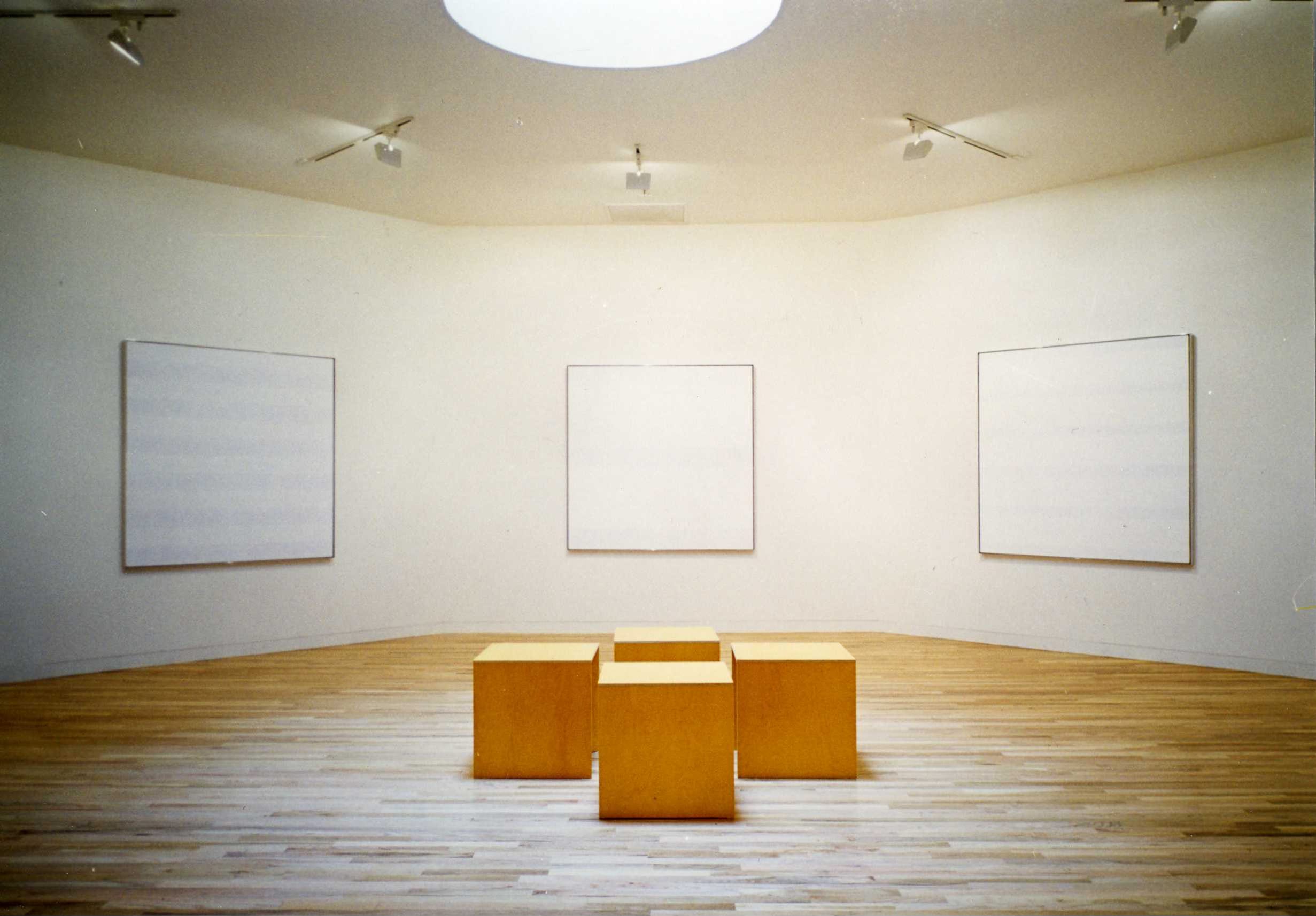
The Agnes Martin Gallery at the Harwood Museum in Taos was built for seven of her paintings and nothing else. Skylight overhead, Donald Judd benches underneath it, the whole room oriented around these quiet canvases with their soft horizontal lines and barely-there color. Martin helped design the space, selecting the works and suggesting the benches. During her lifetime she came back often, sitting quietly on them herself. She knew people would need somewhere to sit - and apparently, so did she.
This space is one of my favorite art spaces I’ve visited in the world. It’s small. Quiet. Still. A place to sit and think and feel and see for a long time. The paintings aren’t dramatic in color, or in scale. But the power in that room and in Martin’s work is in its quiet ability to move you deeply.
In this case, it’s about simplifying art down to its most important elements - color and shape. This is more or less why I became an artist. This sitting with things, this playing with color, trying out marks and styles to see how to best communicate what you want to feel.
The seven paintings in that room are only blue and white. Martin spent decades making choices like that - pulling back, refining, until every decision was in service of one feeling. My palette looks nothing like hers. But that room taught me something I've carried into my own work: color only does its job when you know why you chose it. She knew why she chose those blues. That question drives everything I paint.
Color is working on you whether you’re paying attention or not.
Walk into the wrong room and your shoulders tighten before your brain registers why. Walk into the right one and you exhale. Doctor’s offices are white because white signals control and cleanliness, meant to reassure, though the jury’s still out on whether it works. Classrooms are often bright because color implies energy and possibility. Luxury hotels go warm, amber and rust and deep teal, because warm says stay, relax, you’re taken care of.
Nobody’s just decorating. They’re directing.
Wes Anderson understands this better than almost anyone working in film. Every frame is a color decision loaded with emotional instruction. The pinks and reds of The Grand Budapest Hotel tell you exactly how to feel about a world that’s absurd and tender at once, and you receive that information in your body before your brain catches up. That’s the whole mechanism.
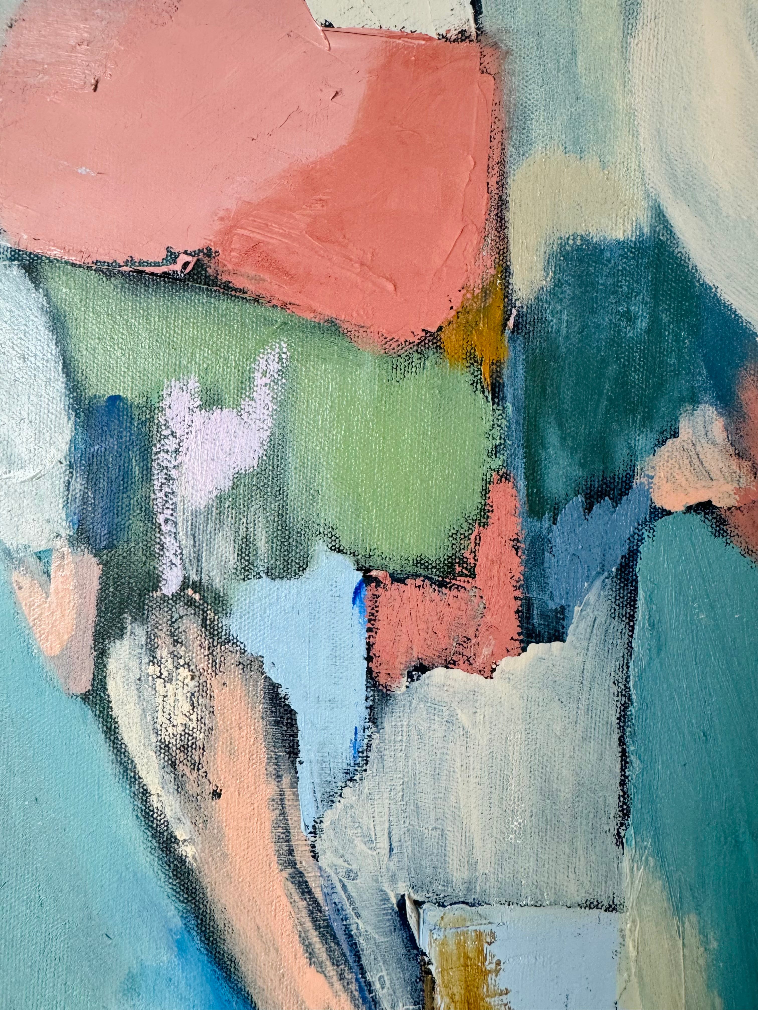
The colors I keep coming back to, and what they actually feel like
My color choices aren’t rational. I pick by feel and rationalize later. After years of that, here’s where I’ve landed:
Dusty blush. Pink with the volume turned down. Warm without announcing itself. The feeling of being comfortable somewhere you didn’t expect to feel comfortable.
Rust. Something weathered that held up. Grounded, earthy, not trying to be pretty. I reach for it when a piece needs honesty more than beauty.
Bright cobalt. The outlier, and probably my favorite. The only color in my palette with actual electricity in it. It wakes things up and changes what’s around it.
Navy. What cobalt becomes when it wants to be taken seriously. An anchor. I use it to settle a piece that’s getting away from me.
Sage. The color that gives other colors room to breathe. The pause between things.
Yellow. Small, intentional, almost never the main event. But a pop of it in the right place does something almost physical, changes the temperature of everything around it.
Most people have a color language they’ve never quite named. You know which colors make you feel like yourself and which ones don’t, even if you’ve never said it out loud.
The rooms you love, the clothes you keep reaching for, the art that makes you stop. It’s all the same conversation, just in different forms.
Which color do you reach for when you need to feel calm? Genuinely curious.
Love this! You nailed it! So thoughtful and thought provoking! Thanks Jill!!