

My most core memories are stored not as stories, but as colors. A multi-colored pastel floral comforter from early childhood that wrapped me in safety. My brother's brightly striped shirt - so perfectly 70s - that I can still see him wearing as he raced through the woods behind our house. My yellow satin trimmed blanket, red patent Mary Janes, my sister’s vibrant pink Coca Cola ruby worn on repeat, our copper brown sedan, my grandmother’s perfectly tinted baked bread, the tan brick of our home with its emerald green carpeting, the most perfect sapphire hued prom dress.
Each decade has brought its own palette, reflecting not just my aesthetic preferences but my emotional landscape. Navy, bubble gum pink, and mint green became the love language of my thirties - I credit my love affair with all things Marc Jacobs for this trio's enduring presence during that era.
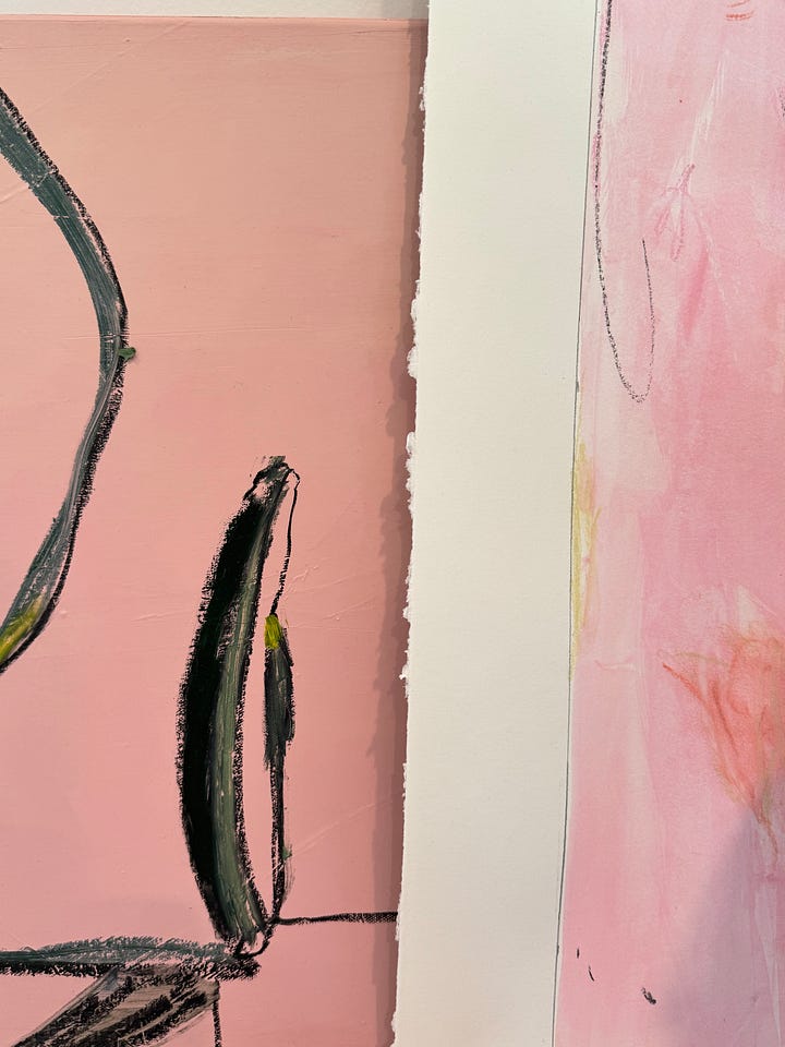
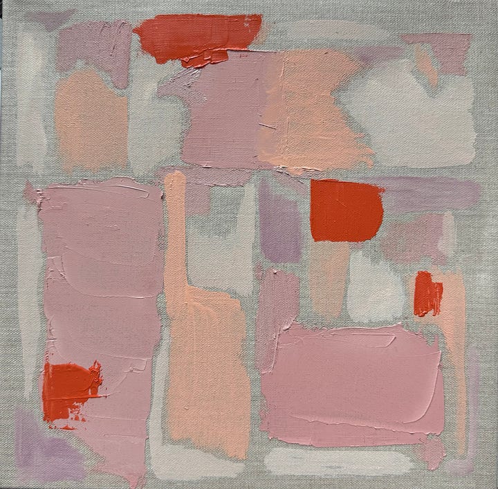
Dusty pinks and rusts, my first pigments crushed from rocks, became an obsession in 2014 when I started dreaming of a life that felt more free and creative than the one I was currently building.
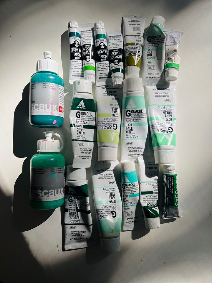
Seaside blues and nuanced greens became the backdrop I craved in my early forties as I contemplated even more life changes, calling in peace, calm, and connection.
These colors didn't just fill my world visually - they became the emotional swatches I paint again and again. Color, I've learned, is memory's most faithful companion. It bypasses logic and goes straight to the heart, unlocking feelings and memories we thought we'd forgotten.
Scientists tell us that color and memory are neurologically linked, that our brains store emotional experiences alongside their visual cues. As an artist, I also think there's something deeper at work - color becomes the language our hearts speak when words aren't enough.
“I found I could say things with color and shapes that I couldn’t say any other way - things I had no words for.” -Georgia O’Keefe
When I make swatches or choose the palette for my next painting, I'm not just choosing colors. I'm choosing how I want each piece to feel, what memories I want to tap into, what emotions I'm hoping viewers will experience. The dusty pink that reminds me of both my first lipstick and the faded facades of old-world Italy - a testament to timeless beauty. The seaside blue that always grounds me, connecting me to the calm of open water, a reminder that even as tides change, peace is always available. The joy I feel when I spot an unexpected garden awash in many shades and tints, rarely planned but often perfect - a nudge to take risks, to play, to break with plans and experiment.
There's something profound about realizing that the colors surrounding us today will become tomorrow's nostalgic triggers. With our recent move to Austin, I traded our pink sofa and bright wallpapers for more subtle and nuanced shades of dusty blues, textured creams, and grounded greens. This palette reflects the calm and ease I was calling in for this new phase - blended family, new home and city. These are the colors my future self will remember, the hues that will someday transport me back to this exact moment in my life.
Our relationship with color is deeply personal, shaped by memory and emotion in ways we're only beginning to understand. Perhaps that's the beauty of it - in a world that often feels overwhelming, color offers us a simple way to connect with our past, express our present, and dream our future into being.
The colors of our lives aren't just decoration. They're memories written in hue and shade, a visual diary of who we've been and who we're becoming.


Straight to the soul with this one Jill!! Love 🌈🌈🌈