

The Blue I Keep Circling
on ultramarine, obsession, and the color that asks you to be sure
As an artist, I consider myself a communicator with color. Its own language, used to convey emotion, meaning and character... the possibilities of what a hue, a shade, a color combination will say are endless.
I especially love to spot and collect colors in nature and out in the world that spark my imagination, informing a painting, a styled room, an outfit. Lately there’s one blue that doesn’t just spark imagination, it asks me to pay closer attention.
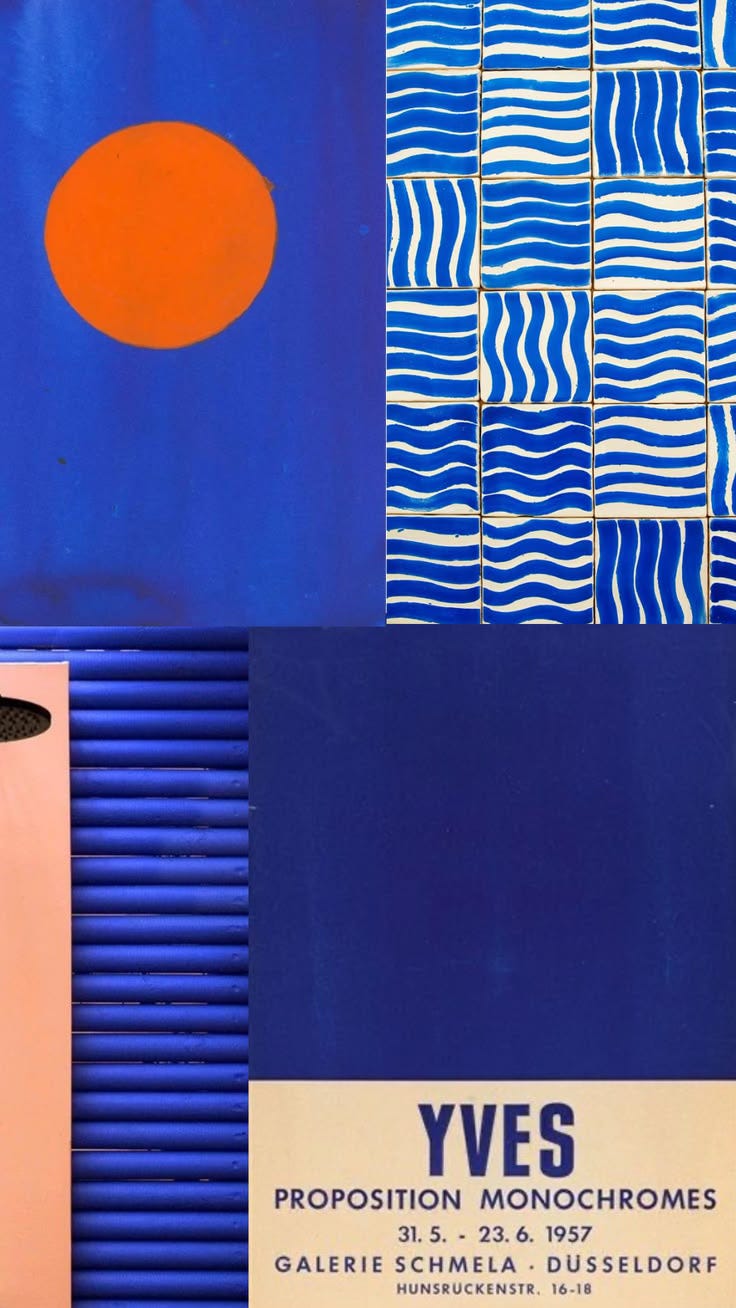
(International Klein Blue, the shade that started it all)
In 1960, a French artist named Yves Klein walked into the French patent office and registered a color. Not a painting. Not exactly a technique, though that’s the legal fiction that allowed it, since under French law you can’t actually own a color. What he registered was a process: a specific way of suspending pure ultramarine pigment in a synthetic resin so the blue kept all its raw, powdery intensity instead of dulling into something safe the way oil paint always did.
He called it International Klein Blue.
Before Klein, ultramarine itself had its own storied history. Once extracted from lapis lazuli mined in the mountains of Afghanistan, it was considered more precious than gold. Michelangelo couldn’t afford it. Vermeer used it so freely he died in debt. For centuries it was reserved for the robes of the Virgin Mary, the cloaks of royalty, the most sacred passages of the most important paintings. It was the superlative blue. The end-all blue. The blue to which all other hues quietly aspired.
Klein just took that obsession further than anyone had before.
What does it take to fall in love with a color so completely you want to own it?
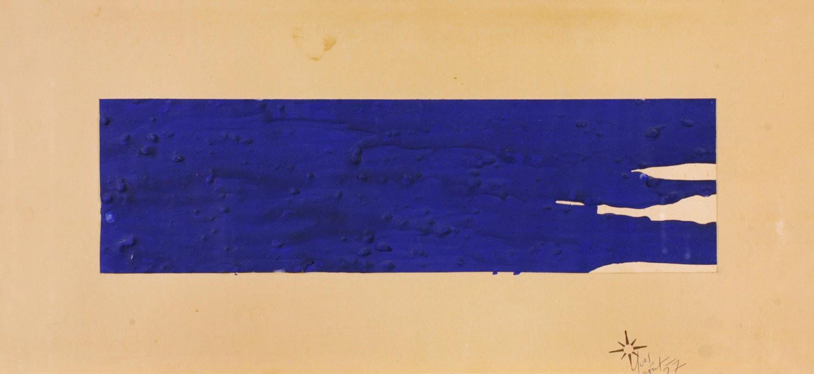
Untitled Blue Monochrome, Yves Klein, 1957
Klein once said the sky was his first artwork. He wasn’t being precious about it. He genuinely believed that blue, the right blue, wasn’t decoration. It was a kind of infinite space you could fall into. He called IKB “pure space.” He said it held values beyond what could be seen or touched. He designed his canvases to dilate your pupils and draw you in, the way a Rothko color field holds you longer than you planned to stay.
Standing in front of a Klein monochrome at MoMA or the Centre Pompidou, I think you understand exactly what he meant. It’s a blue that makes you feel like you’re standing too close to something.
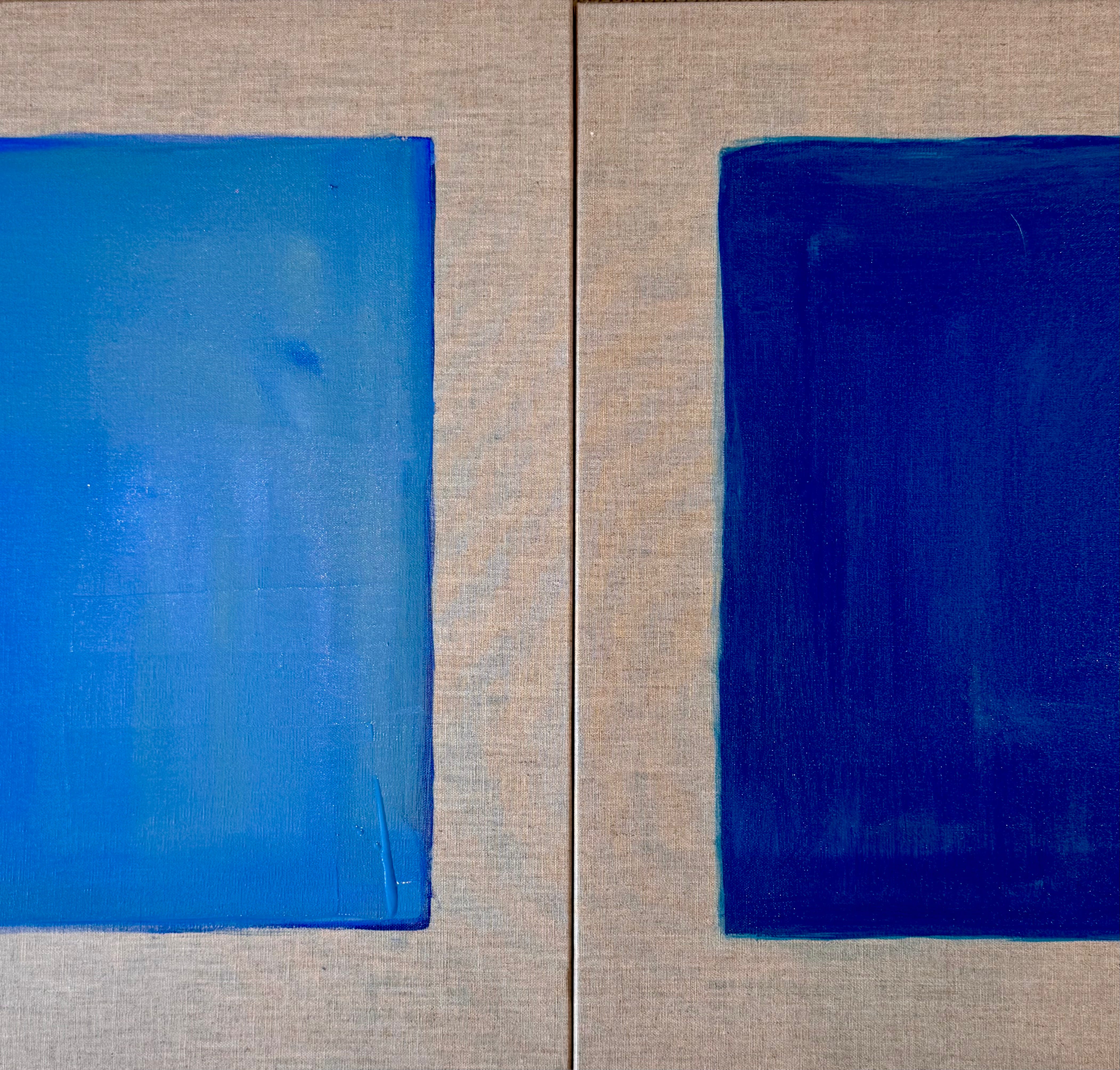
(a few blues from my own studio)
IKB isn’t gentle. It isn’t the contemplative blue of a worn pair of jeans or a quiet coastal sky. It’s saturated, electric, bold in its clarity. Klein used it on full canvases, on sculptures, even on human bodies pressed directly into wet paint to create his famous Anthropometry series. There was no subtlety to it because subtlety wasn’t the point. Presence was the point.
Is there another color that demands to be felt rather than simply seen?
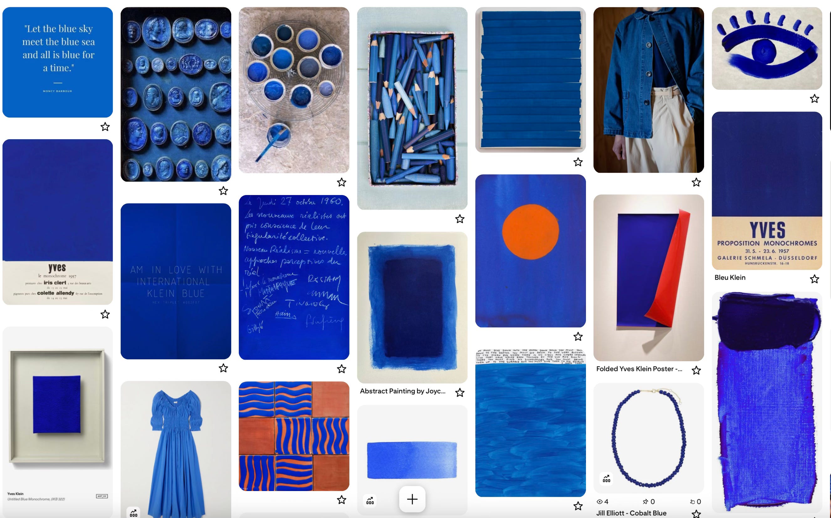
(more blue obsessing, via my pinterest)
It’s strange to love a color this intensely while also being able to find it everywhere, quietly, in places that have nothing to do with Klein at all. Moroccan doorways. The deep well of a Mediterranean afternoon. A particular hour of dusk when the sky goes that one shade darker than blue is supposed to go. Cobalt glass catching window light. The cover of a paperback you can’t put down.
It’s a color that feels like conviction. Like certainty. Like the part of you that knows exactly what it wants and isn’t going to apologize for it.
And that certainty, that going-for-it quality, is precisely why I feel so drawn to it right now. Sometimes I find myself sprinkling it in amongst my tried and true dusty blushes and sagey greens, letting it play a supporting role. Other times I want to let it stand completely alone, holding its own power, needing nothing beside it.
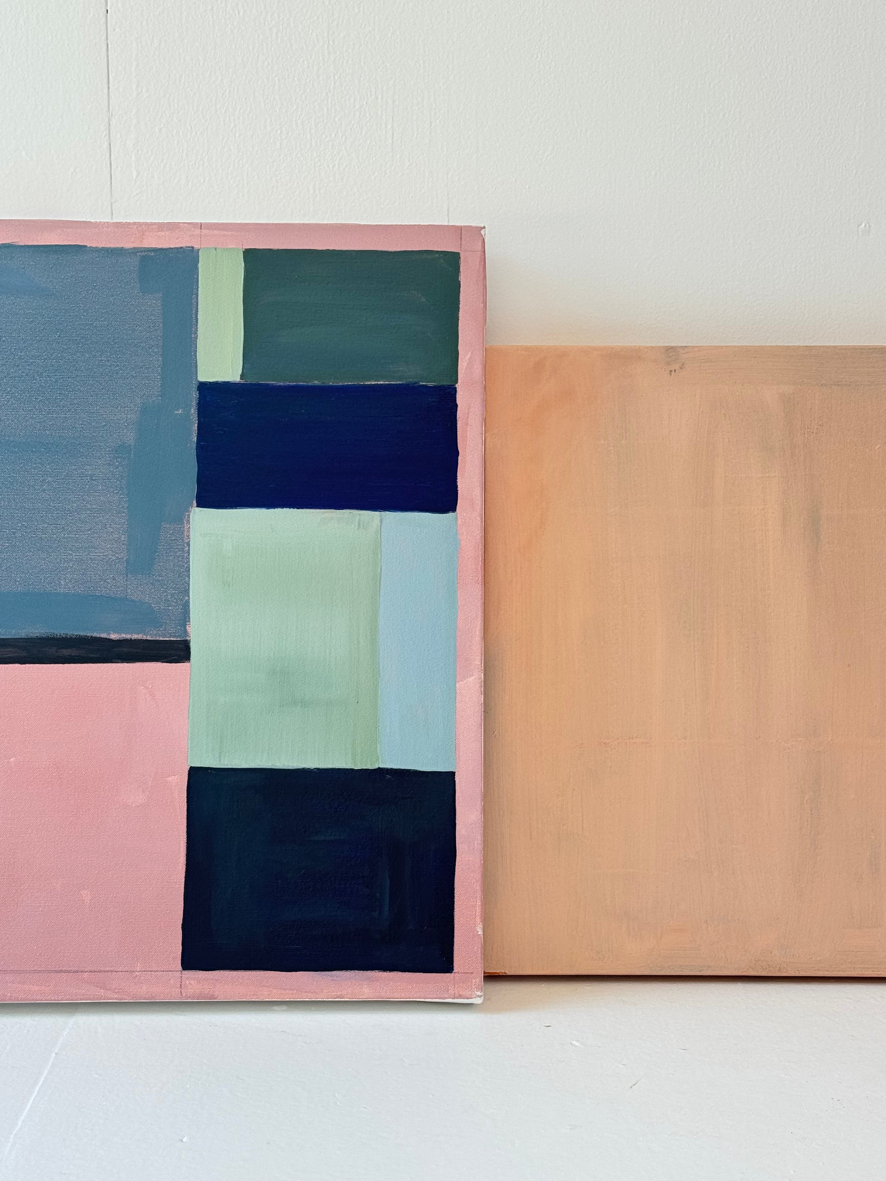
(what I’m chasing in the studio right now)
I’ll admit I’ve spent a long time circling this blue in my own work without quite committing to it the way Klein did. Dusty pink lets you be soft. This blue does not. It asks you to be sure.
And sure I have not always been. I think that’s the nature of being an artist... of putting a piece of yourself into the work, consistently, vulnerably, over and over again. Whether it’s writing or painting or dancing, whatever the daily practice your craft requires, the real work underneath all of it is the same. Showing up. Standing there with your heart on display. Making something and sending it out into the world without knowing quite how it will land, or whether it will land at all. That kind of courage doesn’t arrive once and stay. You have to find it again every time you pick up the brush.
If this blue has you obsessed too... a few ways to bring it home.
On the walls:
Little Greene Smalt — the closest thing in the paint world to IKB for interior use. A beautiful, vibrant blue with real depth and confidence. Design pros consistently reach for it as their Klein blue equivalent, and it won’t overwhelm a room the way true IKB might.
Benjamin Moore Evening Blue — the more accessible, widely available option. Moody and rich, with a depth that works beautifully on a ceiling, a single statement wall, or a piece of furniture you want to transform overnight.
In the home:
Klein Blue ceramic vase, INSPECIAL HOME — a handmade ceramic in a true IKB-adjacent gloss finish. The kind of object that earns its place on a shelf just by existing.
Etsy — Yves Klein Blue decor and art prints — a genuinely good rabbit hole for prints, handmade objects, and one-of-a-kind pieces in this shade. Fair warning : I spent longer here than I planned to.
To wear:
Klein blue is having a serious fashion moment right now. Bottega Veneta, Chanel, and Givenchy all leaned into IKB for their Fall 2026 collections as statement outerwear and evening dresses. Which means you’ll soon be seeing it everywhere. A few of my recent purchases or loves : these perfect pants, this timeless investment bag with the blue lining, these sneakers.
happy color hunting!
XX. Jill
In this season amidst the buzz of instant AI art and the push/pull of working mom summer life, feeling sure about my work often feels like a thought I can’t hear myself think (who has the time?!). Staring into these dazzling blues and re discovering Klein’s work is giving me pause (and life) this morning. Love your insight always Jill 💙
That is one of my favorite colors. Blue. Our bathroom and hallway is painted in a lighter color blue. Our kitchen is yellow but not very bright, yellow. More like a soft color yellow.